Designing a conference presentation that positioned Arkana as Indonesia's premier Odoo partner, in a room full of competitors
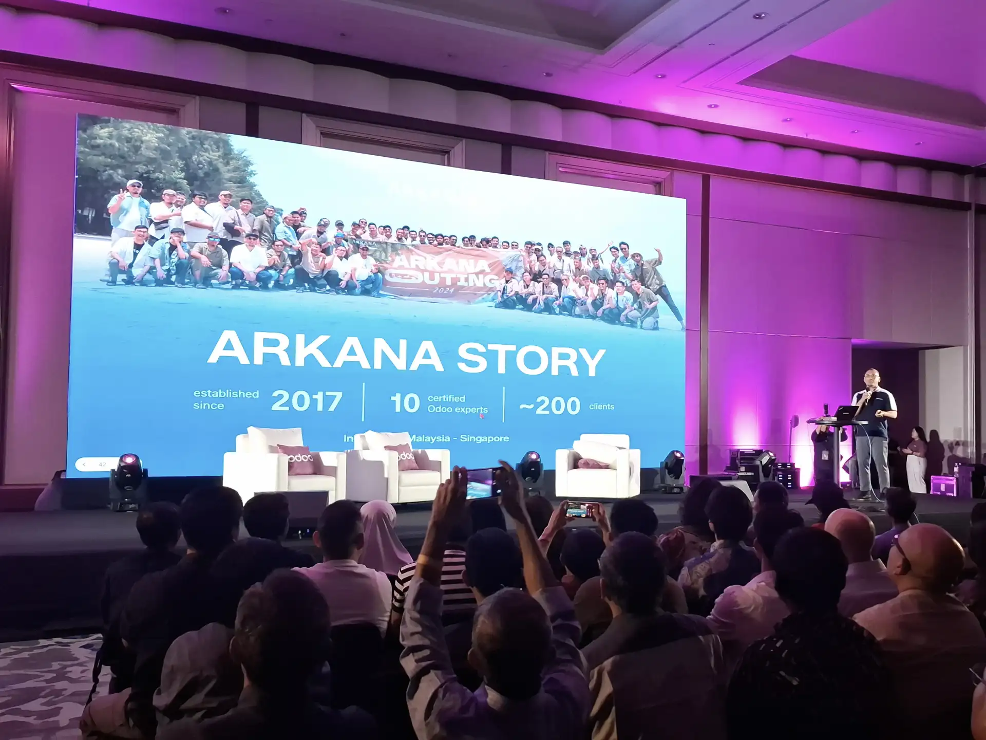
Arkana is an IT consultancy specializing in Odoo ERP implementation, serving over 200 clients across retail, government, manufacturing, and enterprise, established since 2017.
Role 🎮
Slide Deck Designer
Type 🧑💻
Full Time
Industry 🌐
IT Consultant
Timeline 📅
Jan 26'
Business Context
Arkana is an Odoo-certified IT consultancy that kicked off its journey in 2017. With a team of 10 certified Odoo experts, they proudly serve around 200 clients across Indonesia, Malaysia, and Singapore. Their offerings include everything from ERP implementation and IoT integration to database management and training, catering to a diverse clientele that ranges from mid-market companies to major government enterprises like Bulog, one of Indonesia's largest state-owned food distribution organizations.
The Odoo Days Indonesia 2026 event was a standout occasion, marking the largest gathering of the Odoo ecosystem in the country. It attracted a diverse crowd of business leaders, tech decision-makers, current Odoo users, and companies on the lookout for ERP solutions. Arkana took the spotlight as the main sponsor, aiming to generate quality leads and boost their brand visibility among mid-market to enterprise-level companies. With several Odoo partners also presenting at the event, they were all vying for the attention of the same audience.
The Odoo Days Indonesia 2026 event was a standout occasion, marking the largest gathering of the Odoo ecosystem in the country. It attracted a diverse crowd of business leaders, tech decision-makers, current Odoo users, and companies on the lookout for ERP solutions. Arkana took the spotlight as the main sponsor, aiming to generate quality leads and boost their brand visibility among mid-market to enterprise-level companies. With several Odoo partners also presenting at the event, they were all vying for the attention of the same audience.
Problem
At a specialized technology conference where several Odoo partners are showcasing their offerings at the same time, standing out isn’t just about branding, it’s essential for generating leads. A business leader in that room is quickly assessing the capabilities and credibility of potential ERP partners based on limited information. Each partner's presentation serves as a direct alternative to Arkana's.
The specific challenge here is that other Odoo partners at the event were relying on standard flat design decks, visually bland and hard to tell apart. For Arkana, which targets mid-market to enterprise companies with complex implementation needs, looking similar to smaller or less specialized partners could weaken their credibility before the speakers even had a chance to make their case. In a room filled with decision-makers, the presentation deck is the first glimpse of what kind of partner Arkana truly is.
The second hurdle was structural: Arkana had to convey four key messages in a single live presentation (who we are, what we do, who we’ve worked with, and how to get in touch) to an audience that had varying levels of familiarity with both Arkana and Odoo. Without a clear hierarchy of information, the deck risked informing without truly persuading.
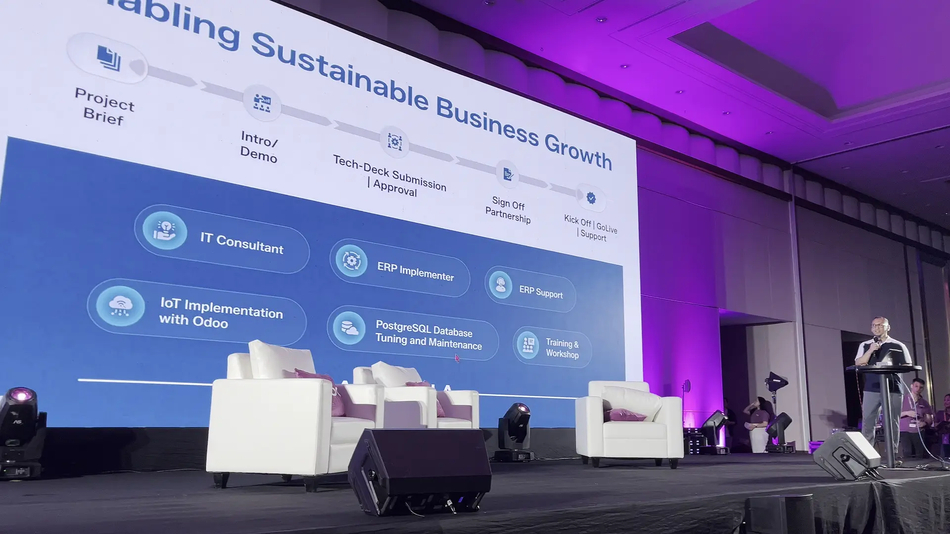
Goal
Create a presentation deck that showcases Arkana as a leader in the room, instantly conveying a sense of enterprise-level capability. The information should be organized in a thoughtful sequence that builds trust, highlights our scale, and encourages the audience to take action—whether that’s visiting the Arkana booth or reaching out directly.
The deck should complement live speakers rather than overshadow them, serving as a visual guide for each section instead of a script. Each slide must deliver a single, clear message that supports what the speaker is saying, keeping the focus on their words.
Additionally, we need to stick to Arkana's existing brand colors—white, light blue, and gradient. The challenge lies in enhancing this palette to give it a premium, enterprise-ready feel without completely overhauling the brand.
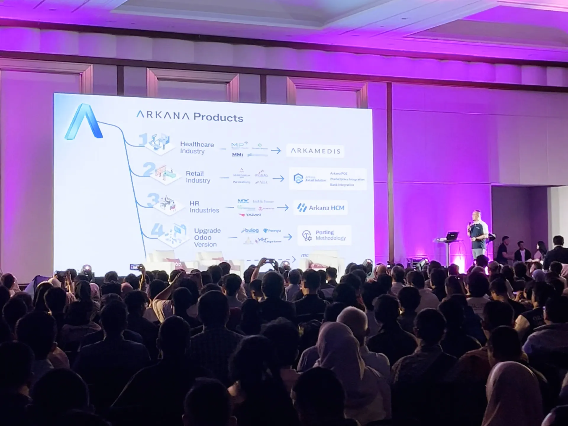
Developing Design Decision
The glass aesthetic and premium visual appeal
At the event, competitor presentations leaned heavily on flat design — which, while clean, felt a bit too generic and similar across the board. For Arkana, aiming at mid-market and enterprise clients, we needed our deck's visual language to send a clear message: we operate at a level that goes beyond the typical implementer. By incorporating a glass effect into our shapes and refining the AI-assisted glass logo to perfectly match Arkana's brand gradient, we created a look that feels thoughtful, premium, and mature, all while staying true to our brand identity. In a room full of competing options, our design language serves as a powerful positioning statement.
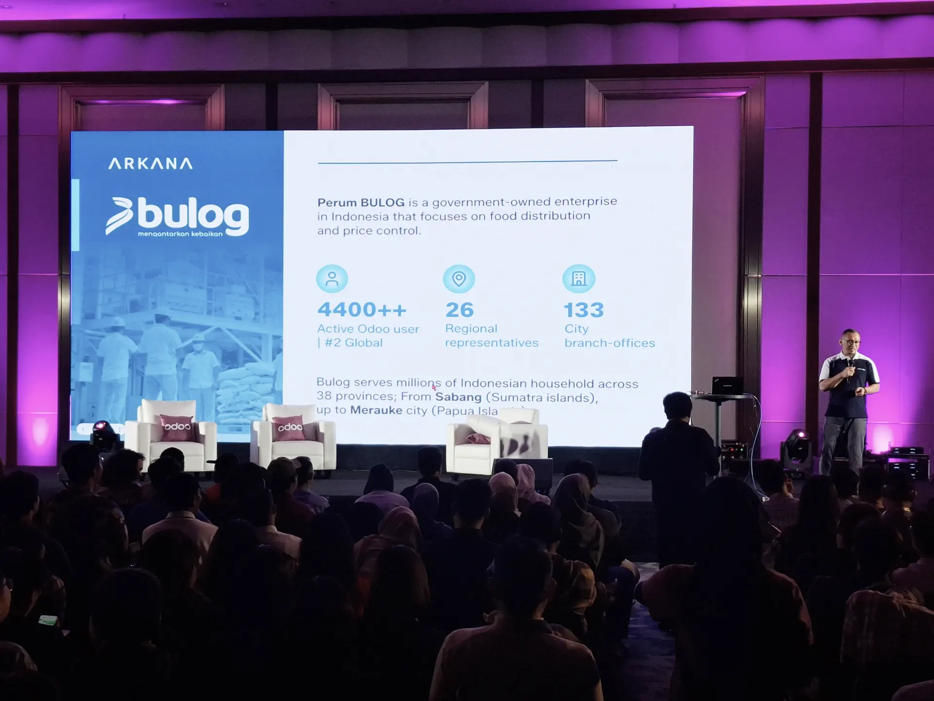
The Bulog slide as a focal point
The design challenge in this slide was all about making sure the information hit home right away in a live conference setting, where slides flash by in seconds and the speaker drives the story. Two key decisions shaped how we executed this. First, we made the key metrics — 4,400+ active users, 26 regional representatives, and 133 city branch offices — much larger and set them apart from the supporting text. This way, the numbers catch the eye before the words do. In a room where people are both listening and scanning, leading with the most credible data point helps ensure the main message gets through, even if attention is divided. Second, we paired icons with each metric to speed up recognition. A viewer doesn’t need to read "active Odoo users" to grasp what the number means if the icon already conveys it. This mix of bold numbers and relevant icons made it easier to digest three distinct proof points at a glance.
At the event, competitor presentations leaned heavily on flat design — which, while clean, felt a bit too generic and similar across the board. For Arkana, aiming at mid-market and enterprise clients, we needed our deck's visual language to send a clear message: we operate at a level that goes beyond the typical implementer. By incorporating a glass effect into our shapes and refining the AI-assisted glass logo to perfectly match Arkana's brand gradient, we created a look that feels thoughtful, premium, and mature, all while staying true to our brand identity. In a room full of competing options, our design language serves as a powerful positioning statement.
The Bulog slide as a focal point
The design challenge in this slide was all about making sure the information hit home right away in a live conference setting, where slides flash by in seconds and the speaker drives the story. Two key decisions shaped how we executed this. First, we made the key metrics — 4,400+ active users, 26 regional representatives, and 133 city branch offices — much larger and set them apart from the supporting text. This way, the numbers catch the eye before the words do. In a room where people are both listening and scanning, leading with the most credible data point helps ensure the main message gets through, even if attention is divided. Second, we paired icons with each metric to speed up recognition. A viewer doesn’t need to read "active Odoo users" to grasp what the number means if the icon already conveys it. This mix of bold numbers and relevant icons made it easier to digest three distinct proof points at a glance.
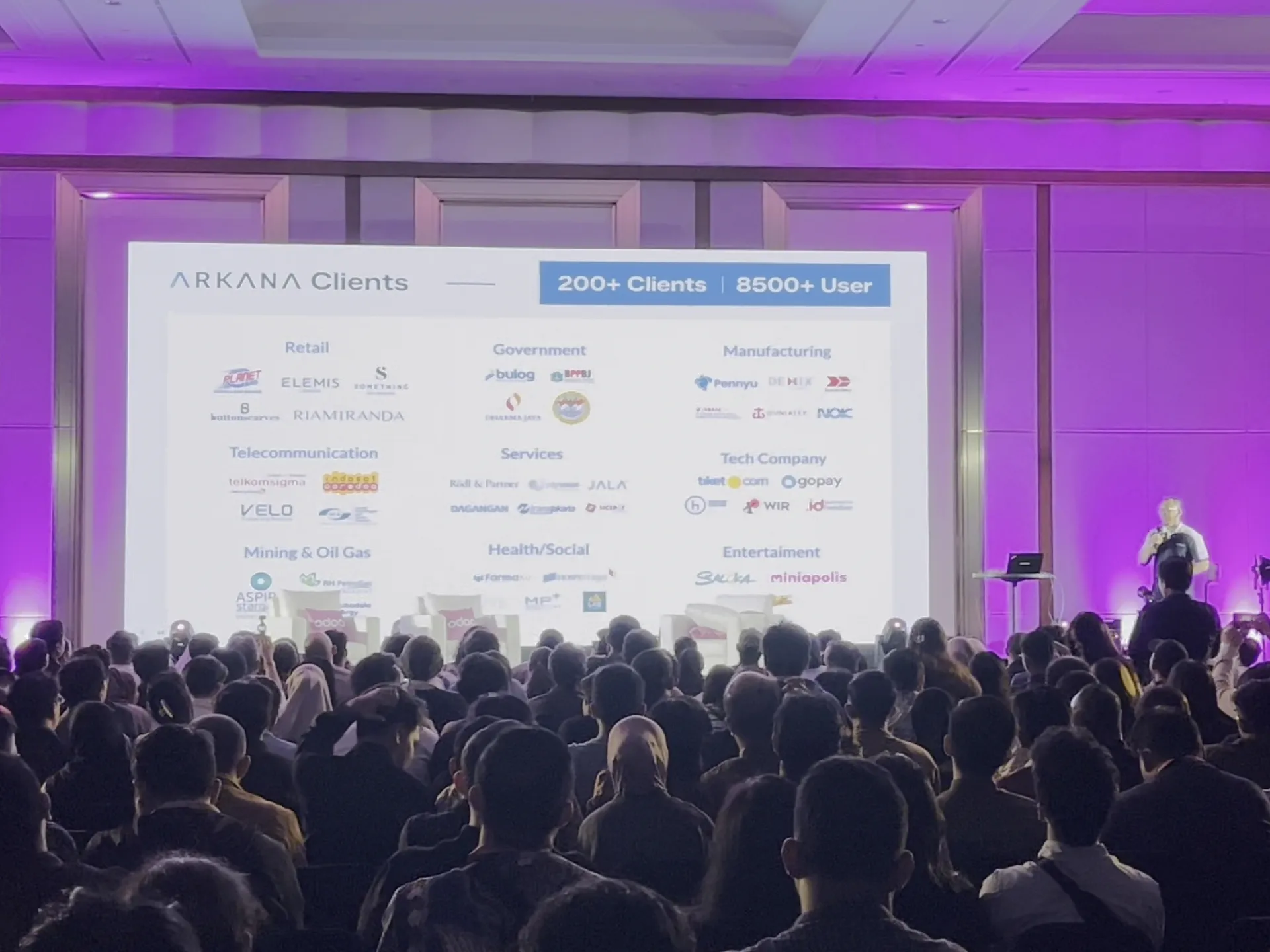
The clients slide structure
The way we present our clients is crucial. Just listing over 200 client logos would create a daunting wall of names. By organizing them into categories like retail, government, manufacturing, telecommunications, and tech, we turned that data into a clear competency map. Now, when a decision-maker in manufacturing looks at that slide, they can quickly spot our relevant experience. This categorization was a thoughtful choice in how we structured the information, not just a random layout decision.
The megamendung batik element
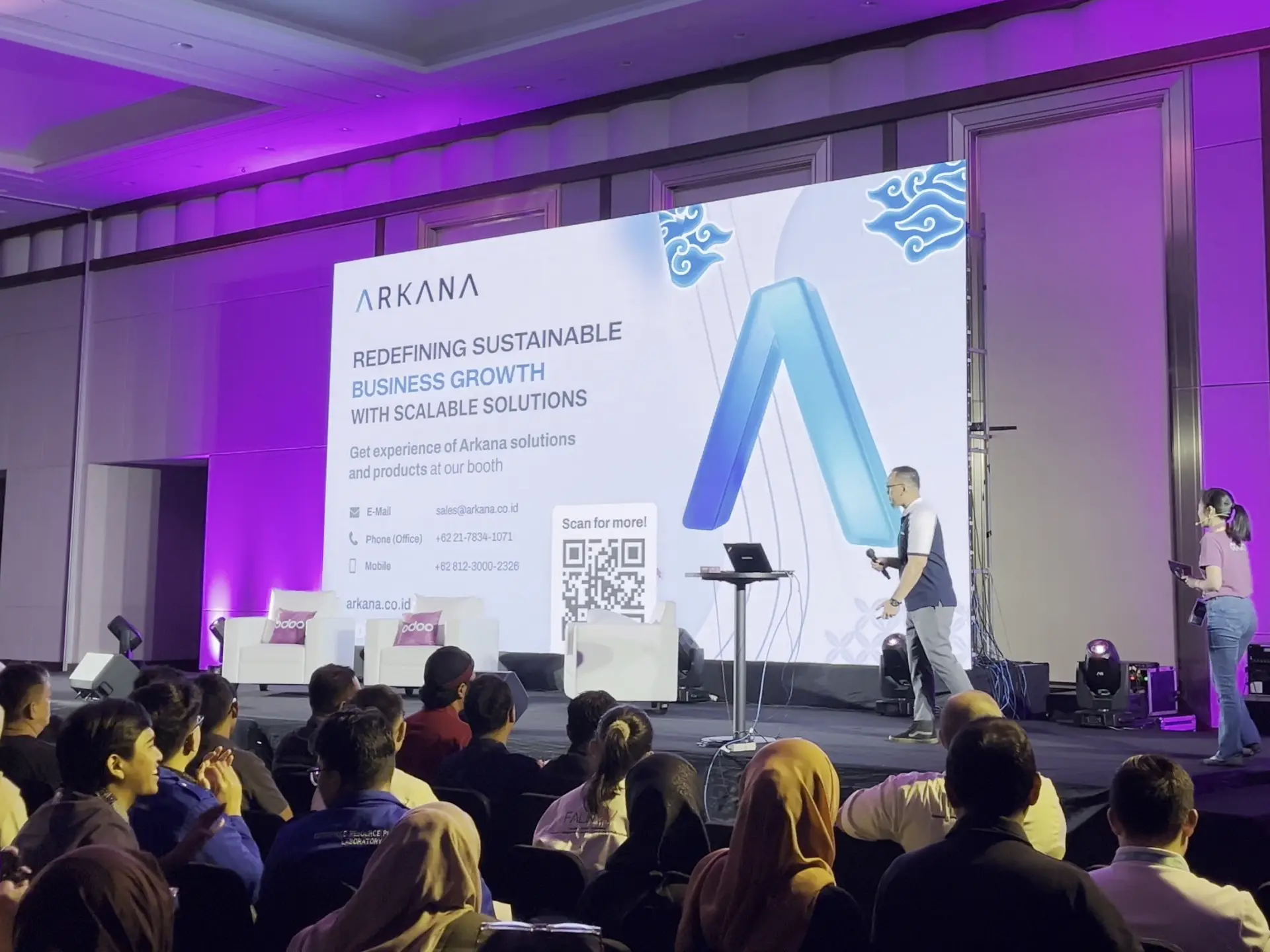
The megamendung pattern makes an appearance on the closing slide in Arkana's signature blue palette, as a clear nod to our Indonesian roots and pride. In an Odoo ecosystem filled with international partners, our identity as a homegrown Indonesian consultancy is a strength, not a drawback. The batik element sends a message: we are rooted here, we understand this market, and we take pride in it.
The way we present our clients is crucial. Just listing over 200 client logos would create a daunting wall of names. By organizing them into categories like retail, government, manufacturing, telecommunications, and tech, we turned that data into a clear competency map. Now, when a decision-maker in manufacturing looks at that slide, they can quickly spot our relevant experience. This categorization was a thoughtful choice in how we structured the information, not just a random layout decision.
The megamendung batik element
The megamendung pattern makes an appearance on the closing slide in Arkana's signature blue palette, as a clear nod to our Indonesian roots and pride. In an Odoo ecosystem filled with international partners, our identity as a homegrown Indonesian consultancy is a strength, not a drawback. The batik element sends a message: we are rooted here, we understand this market, and we take pride in it.
Wrap Up
Arkana's presence at Odoo Days Indonesia 2026 (speakers, booth, and this presentation deck as a supporting asset) generated over 75 qualified leads from a single event. The deck's role was to do what live conversation cannot do at scale: establish Arkana's credibility, scale, and positioning in the thirty seconds a business leader spends looking at a slide before the speaker moves on.
The most important decision was the visual language. Choosing a premium glass aesthetic over the flat design convention of the category was not a stylistic preference, it was a deliberate signal to mid-market and enterprise decision-makers that Arkana operates at their level. In a room where every competing partner had a slide deck, differentiation at the visual layer was the first filter.
The information architecture (story, methodology, proof, clients, products, close) was designed as a persuasion sequence, not a company overview. Each section answers a specific objection a skeptical buyer would have before committing to a follow-up conversation.
This case study proves the ability to design for high-stakes live business environments where design is not a deliverable — it is a commercial tool.