Making HR feel human. Illustrating Arkana HCM's onboarding and error states for daily employee use
A hybrid illustration system. Built by hand, extended with AI, corrected by craft
Role 🎮
Product Illustrator
Type 🧑💻
Full Time
Industry 🌐
HRIS
Timeline 📅
Sept 25'
Overview
Arkana HCM is an HR management platform serving companies across Indonesia. The mobile app is used daily by employees and HR managers, to submit attendance, request leave, log overtime, and manage expenses. These are routine but consequential interactions: a failed clock-in or a missed leave request has real workplace consequences.
The app was functional. What it lacked was visual language that made those interactions feel guided and human rather than transactional and cold.
The app was functional. What it lacked was visual language that made those interactions feel guided and human rather than transactional and cold.
Problem
Without illustration, the onboarding screens and modal error states communicated through UI and text alone. For an employee using the app to clock in at 7am or request leave under a deadline, a bare error screen — no visual context, no emotional reassurance — creates friction and anxiety precisely when clarity matters most.
The brief from the mobile development team was direct: the app needed illustrations that made its features and error states immediately understandable, without relying on the user reading every word.
The underlying design problem: how do you make an HR app — a category historically associated with corporate rigidity — feel approachable to the employees who depend on it every day?
Goal
Create a cohesive illustration system across two deliverable types — onboarding screens and modal popups — that makes Arkana HCM feel approachable, self-explanatory, and visually consistent throughout.
Success meant: an employee encountering any screen for the first time — whether a welcome screen or a GPS error — immediately understands the context without needing to read the full copy.
Success meant: an employee encountering any screen for the first time — whether a welcome screen or a GPS error — immediately understands the context without needing to read the full copy.
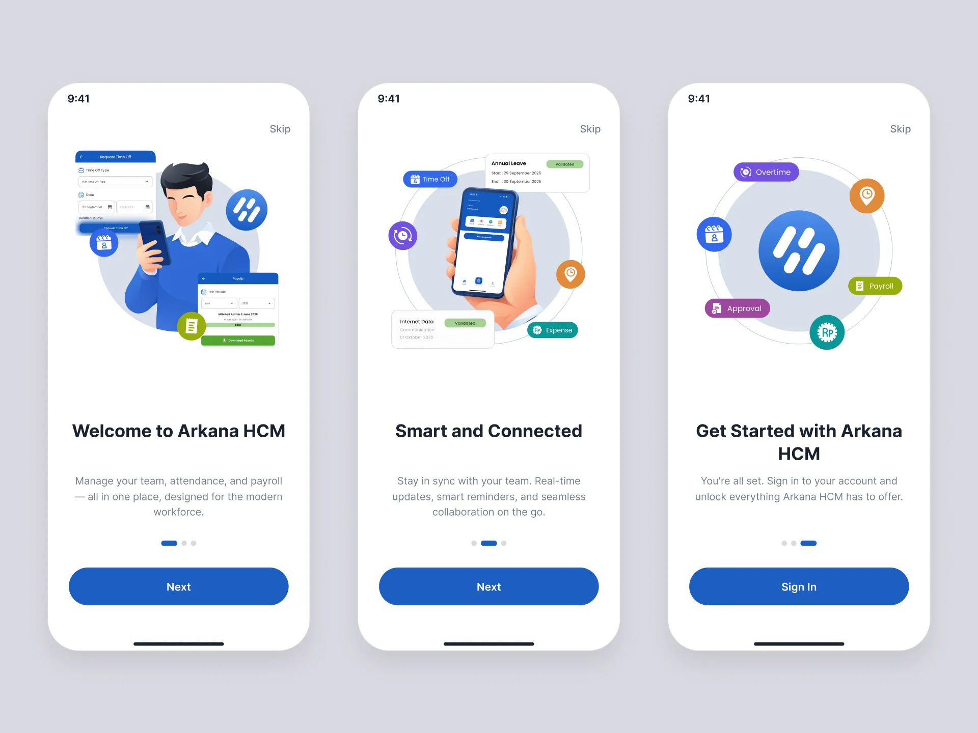
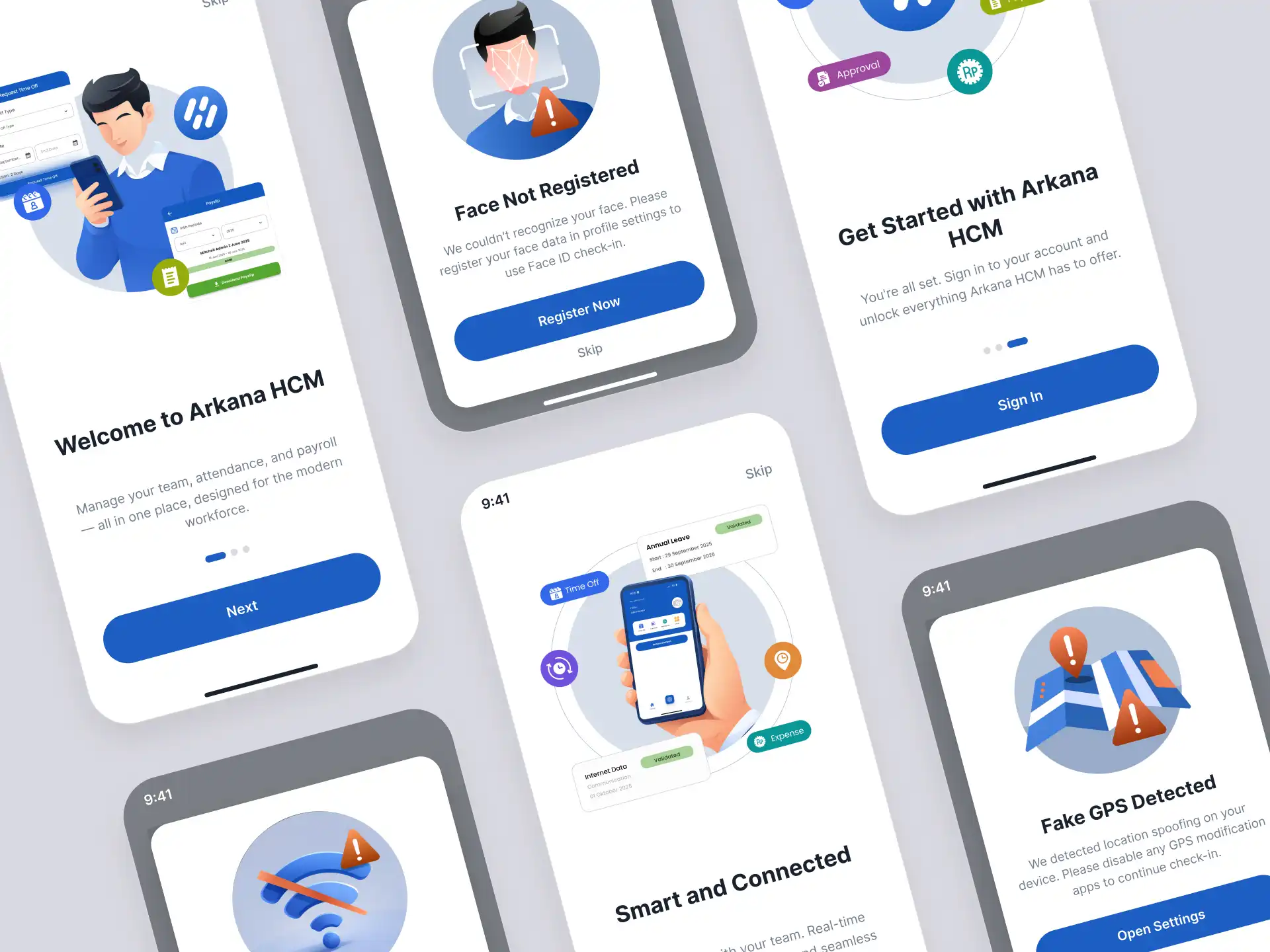
Approach — Onboarding Screens
Three onboarding illustrations, each paired with a specific value proposition.
The first combined an AI-generated character with floating UI elements from the Arkana HCM interface — attendance forms, payroll screens — to communicate the app's core functions visually before a word is read. The second used a hand holding a phone mockup, with the actual Arkana HCM home screen replacing the original display — showing the real product in a human hand, not an abstract frame. The third stripped back to the logo surrounded by floating feature icons — Overtime, Payroll, Approval, Expense — letting the product communicate through its own ecosystem.
The visual logic across all three: show the product in human context, not in isolation.
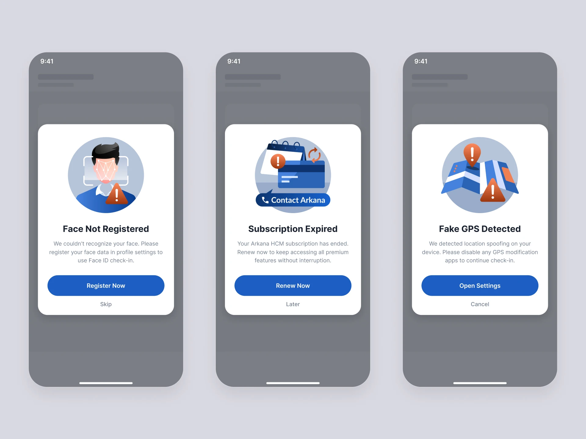
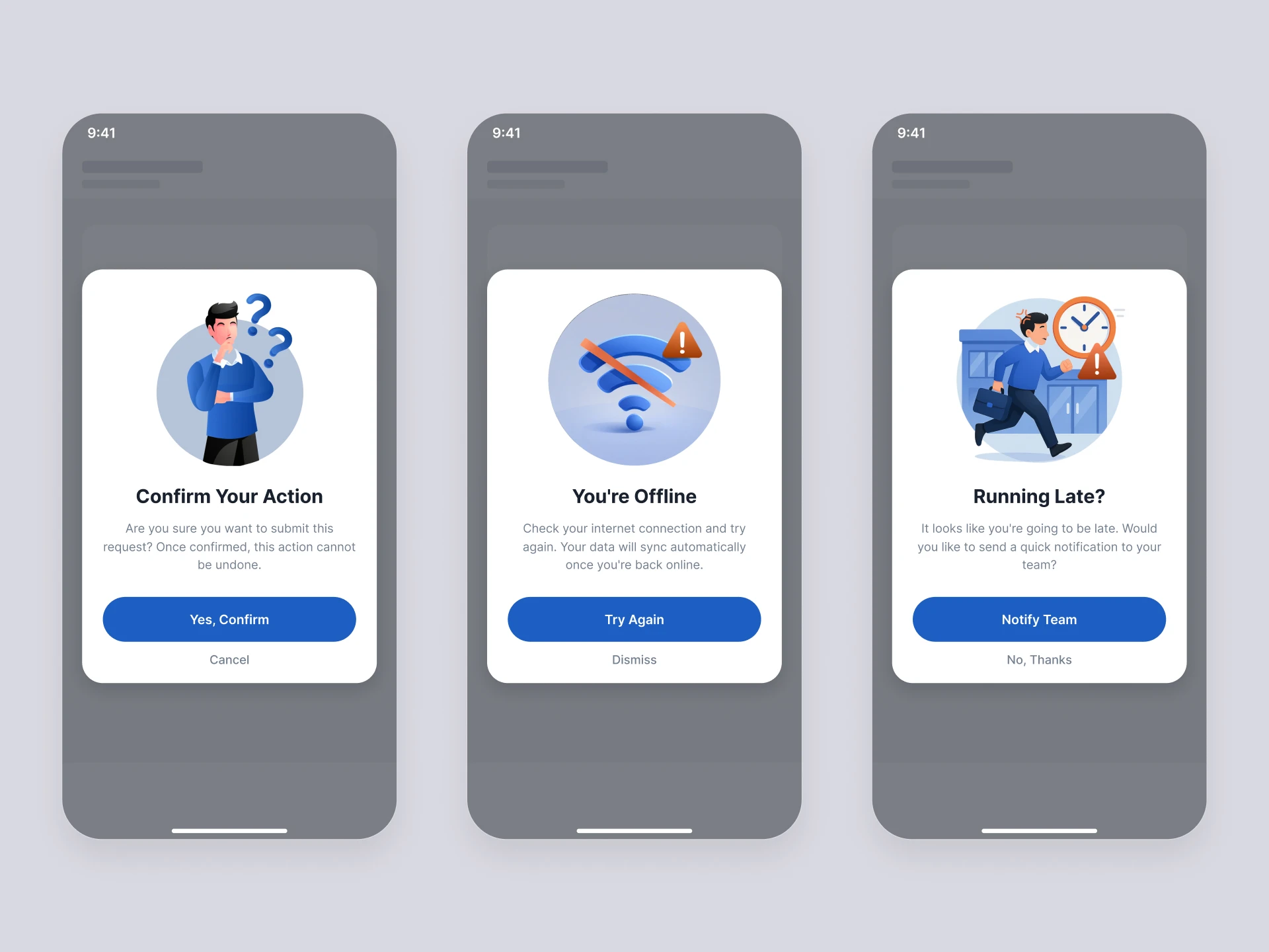
Approach — Modal Illustrations & AI Integration
The modal system required six illustrations covering distinct states: fake GPS detected, renew subscription, offline mode, face recognition not registered, confirmation, and running late.
The first three — fake GPS detected, renew subscription, and face recognition not registered — were illustrated manually. These established the visual language of the system: circular compositions, blue as the primary palette, orange warning indicators, and a deliberate choice to render characters without a neck — a subtle detail that gave the style its consistency and personality.
With those three as the foundation, I used ChatGPT to generate the remaining three, using my original illustrations as the style reference input. Two to three iterations per illustration to reach usable output.
Two corrections were required on every AI-generated result. First, character proportions — the generated figures included a neck, breaking consistency with the established style. Second, the blue values needed adjustment to match Arkana HCM's specific brand blue, which the AI approximated but didn't replicate exactly.
What the AI couldn't preserve: the stylistic decisions I had already made. It generated technically competent work that looked close — but close in an illustration system breaks the system. The corrections weren't optional polish. They were what made the six illustrations function as a coherent set rather than a collection of similar-looking assets.
Outcomes
All six modal illustrations and three onboarding screens shipped and are live in the main Arkana HCM mobile application.
The system achieved what the brief required: each state — welcome screen or GPS fraud warning — communicates its context visually before the user reads the copy. The orange warning indicator functions as a consistent system-wide signal. The circular compositions create visual coherence across states that are functionally very different. The character style — simplified, no neck, approachable proportions — makes the app feel designed for the employee using it, not the enterprise that deployed it.
The system achieved what the brief required: each state — welcome screen or GPS fraud warning — communicates its context visually before the user reads the copy. The orange warning indicator functions as a consistent system-wide signal. The circular compositions create visual coherence across states that are functionally very different. The character style — simplified, no neck, approachable proportions — makes the app feel designed for the employee using it, not the enterprise that deployed it.
What I Would Do Differently
The AI generation workflow was efficient, but imprecise enough to require manual correction on every output. Providing more specific style constraints upfront — or building an explicit reference sheet before prompting — would have reduced iteration cycles.
More broadly: the illustration style was defined through the process of making the first three, not before it. Defining the visual language explicitly — character proportions, color values, composition rules — as a written style guide before using AI as a generation tool would have made the handoff cleaner and the corrections fewer.
That's the workflow I'd use on the next illustration system.