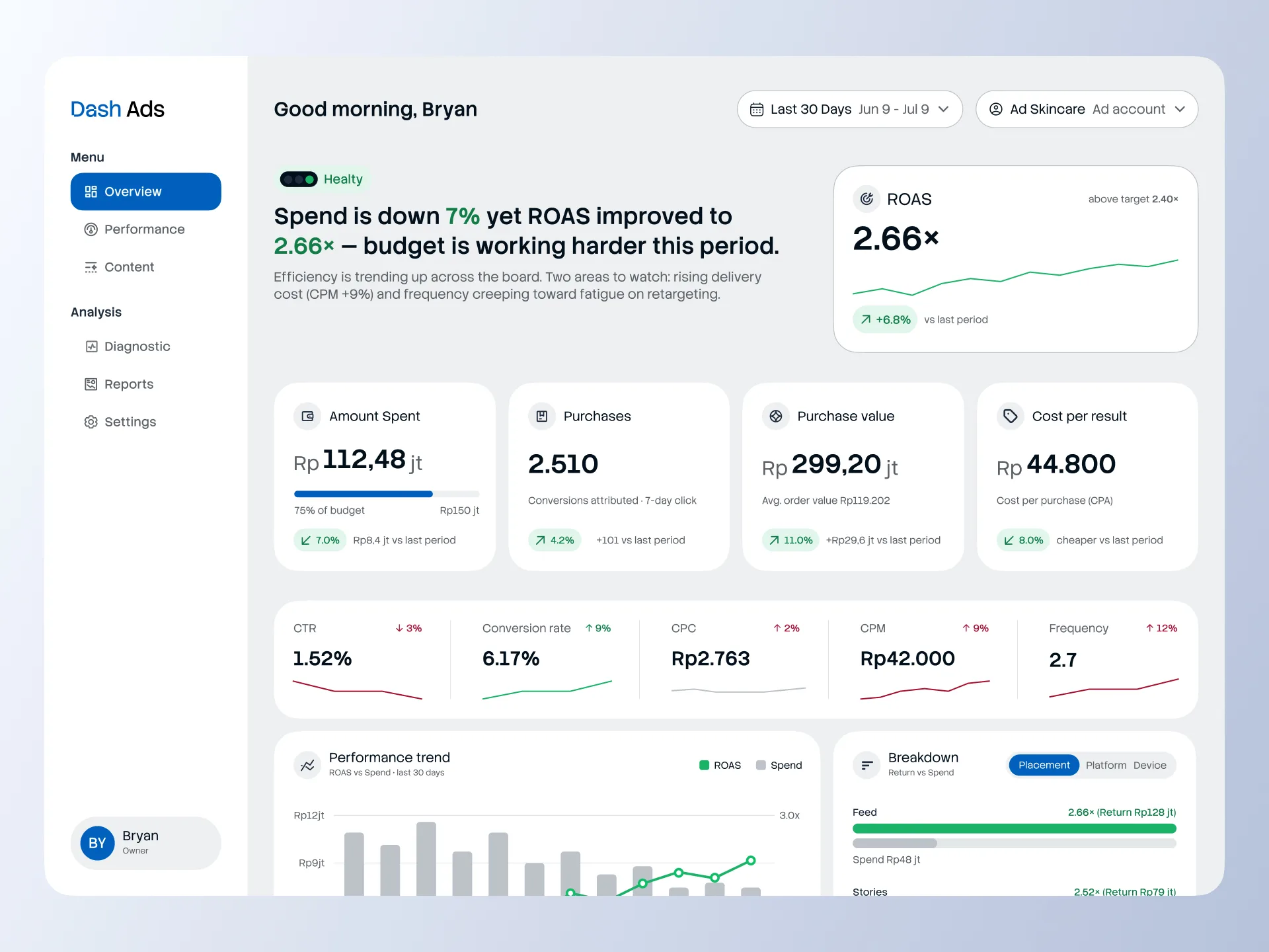
Designed to decide, not to display. An ads performance overview built to be understood in 5 seconds
A self-directed design exercise in turning complex B2B ad data into an instant, human-readable verdict
Role 🎮
Product Designer
Type 🧑💻
Hiring Task
Industry 🌐
SaaS
Timeline 📅
Jul 26'
Overview
A X Company (company name disguised) is a B2B data-product company for retail and marketplace businesses. One of its products, Dash Ads, provides intelligence on advertising performance. This case study is a self-directed design exercise built around a X Company hiring challenge, not a shipped product. The value here is the quality of the thinking and the design decisions, not a production outcome.
I approached it as a real product problem: how do you make ad performance legible to a business owner who doesn't have time to read a report?
I approached it as a real product problem: how do you make ad performance legible to a business owner who doesn't have time to read a report?
Problem
Business owners and marketing teams struggle to read the overall health of their ad spend quickly. Native tools like Ads Manager present data: rows, columns, metrics. But they don't present a conclusion. The user is left to interpret whether performance is good or bad, where the problems are, and what to do next.
The brief demanded a page that answers four questions almost instantly:
1. Are the ads healthy or not?
2. Is budget being used effectively?
3. Which areas are underperforming and need analysis?
4. What information should be prioritised to make a decision?
The design problem underneath all four: a dashboard that shows data is easy. A dashboard that supports a decision is not.
The brief demanded a page that answers four questions almost instantly:
1. Are the ads healthy or not?
2. Is budget being used effectively?
3. Which areas are underperforming and need analysis?
4. What information should be prioritised to make a decision?
The design problem underneath all four: a dashboard that shows data is easy. A dashboard that supports a decision is not.
Goal
Design one high-fidelity desktop page that lets a business owner grasp the general condition of their ad performance in roughly five seconds, before reading any individual number.
Constraints: desktop only, high-fidelity, dummy data, no prototype, no mobile.
Success criteria from the brief: organise complex information into something legible, establish clear visual hierarchy, choose metrics and charts that make sense, and most importantly, build a dashboard that helps the user decide, not just view.
Constraints: desktop only, high-fidelity, dummy data, no prototype, no mobile.
Success criteria from the brief: organise complex information into something legible, establish clear visual hierarchy, choose metrics and charts that make sense, and most importantly, build a dashboard that helps the user decide, not just view.
Outcomes
Verdict-first, not number-first
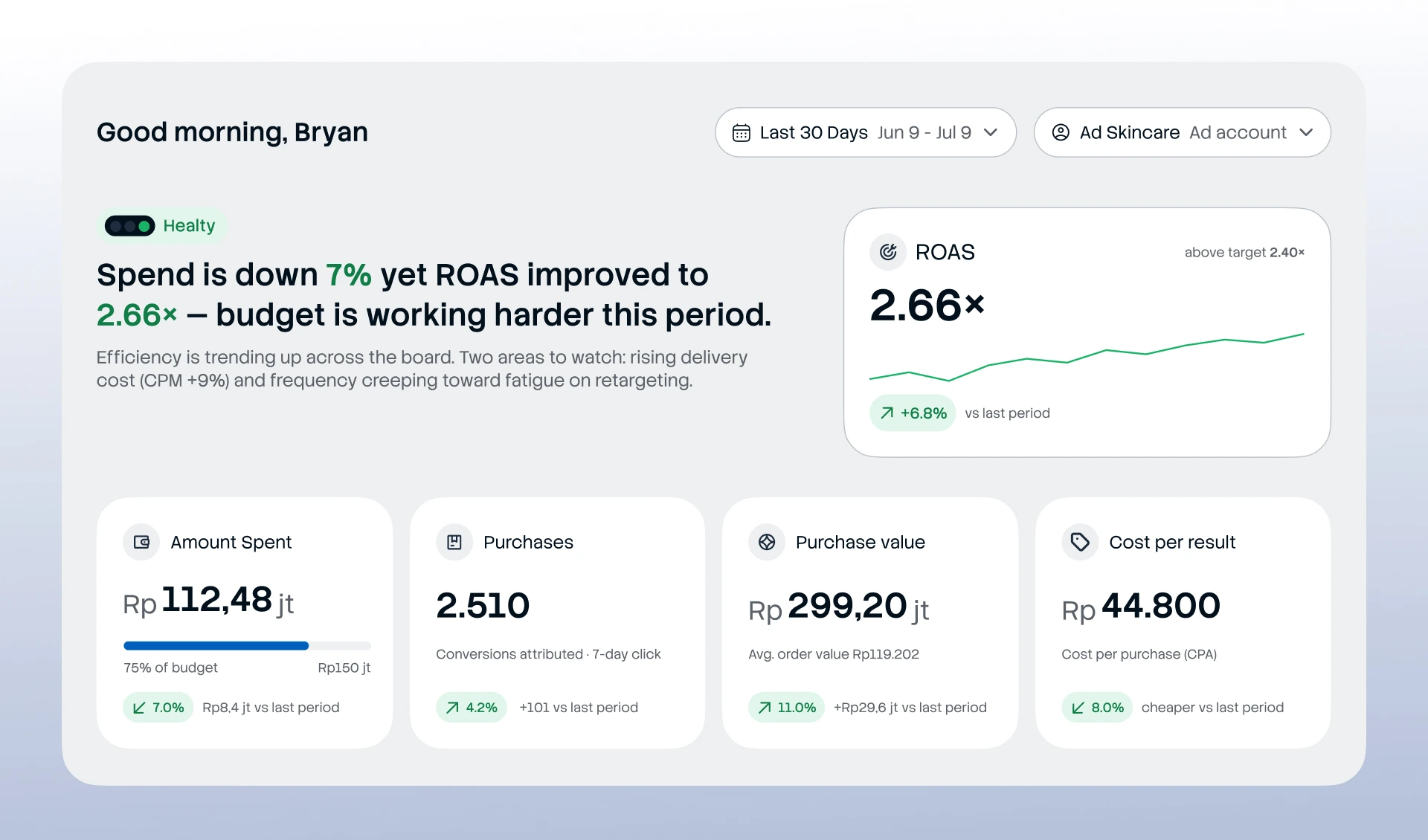
The page opens with a status pill and a plain-language sentence that summarises the condition — "Spend is down 7% yet ROAS improved to 2.66× — budget is working harder this period" — followed by a line flagging the two areas that need attention. This answers "healthy or not?" instantly, in human language, before the user parses any figure.
The page opens with a status pill and a plain-language sentence that summarises the condition — "Spend is down 7% yet ROAS improved to 2.66× — budget is working harder this period" — followed by a line flagging the two areas that need attention. This answers "healthy or not?" instantly, in human language, before the user parses any figure.
Sort by performance, not by spend.
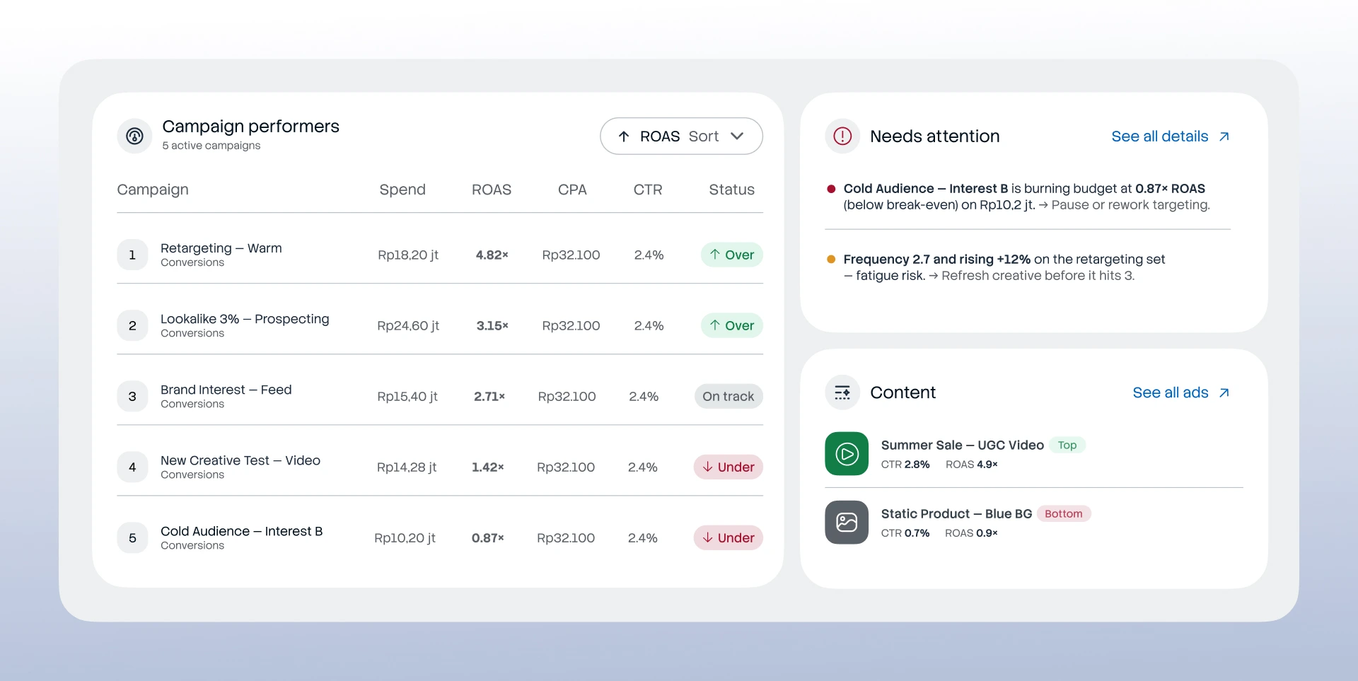
The campaign table defaults to a ROAS sort. The reasoning: the product's job is to find the campaigns that are leaking money — not the ones spending the most. Sorting by spend is the Ads Manager default, and it hides small-but-bad campaigns. Trade-off acknowledged: a toggle could serve users who care more about spend volume.
The campaign table defaults to a ROAS sort. The reasoning: the product's job is to find the campaigns that are leaking money — not the ones spending the most. Sorting by spend is the Ads Manager default, and it hides small-but-bad campaigns. Trade-off acknowledged: a toggle could serve users who care more about spend volume.
A diagnostic layer that explains why.
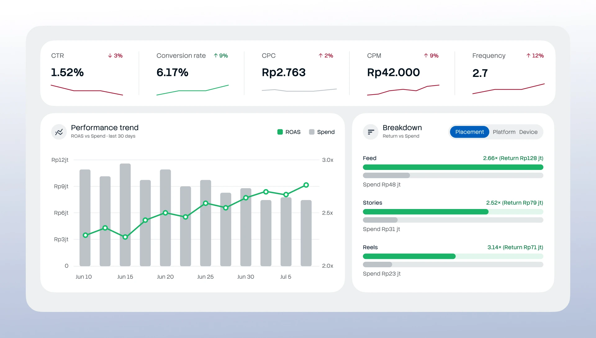
CTR, CPC, CPM, and frequency were added as a paired activity-and-outcome strip. These explain why ROAS moved, shifting the dashboard from reporting outcomes to diagnosing causes.
CTR, CPC, CPM, and frequency were added as a paired activity-and-outcome strip. These explain why ROAS moved, shifting the dashboard from reporting outcomes to diagnosing causes.
Needs Attention as active recommendation.
The module doesn't just point at problems — it prescribes action. "Pause or rework targeting." "Refresh creative before frequency hits 3." This answers brief questions #3 and #4 literally, turning the dashboard from a diagnosis into a next step.
The module doesn't just point at problems — it prescribes action. "Pause or rework targeting." "Refresh creative before frequency hits 3." This answers brief questions #3 and #4 literally, turning the dashboard from a diagnosis into a next step.
The Design. Layout Logic.
The reading order mirrors the four brief questions, top to bottom, left to right:
Header (title, date range, ad account) → hero KPI row (general condition) → trend chart alongside the Needs Attention module (where the problems are) → efficiency diagnostics strip (why) → campaign table (detail and action).
The eye moves from top-left — the overall verdict — to the right, where problems surface, then down into detail and recommended action. The layout is the argument: condition, then problem, then decision.
The reading order mirrors the four brief questions, top to bottom, left to right:
Header (title, date range, ad account) → hero KPI row (general condition) → trend chart alongside the Needs Attention module (where the problems are) → efficiency diagnostics strip (why) → campaign table (detail and action).
The eye moves from top-left — the overall verdict — to the right, where problems surface, then down into detail and recommended action. The layout is the argument: condition, then problem, then decision.
What I Would Do Differently
Feedback from the review,and where I'd take it next: The reviewer noted the layout and information hierarchy as clear strengths. The improvement direction was specific and worth carrying forward: study more clean design references and implement them directly to sharpen UI execution, and more importantly, observe production apps closely to understand the user flows that genuinely make things easier for the customer. The first is a craft investment; the second is a product-thinking one. Both point at the same gap: closing the distance between a well-structured dashboard and a genuinely effortless one.
That the exercise reached the interview stage but not an offer is part of the honest framing. The reflection above is why I'd want a second attempt — and what it would fix.
That the exercise reached the interview stage but not an offer is part of the honest framing. The reflection above is why I'd want a second attempt — and what it would fix.