Designing a web page that made a thesis-stage electric scooter look fundable
EFITS Gen 2 is an Indonesian-developed urban electric scooter, a thesis project seeking institutional funding, with a registered HAKI trademark and a completed performance test.
Role 🎮
Landing Page Designer
Type 🧑💻
Freelance
Industry 🌐
Automotive
Timeline 📅
Jun 25'
Business Context
EFITS Gen 2 is an electric scooter developed as a thesis project by Indonesian university students, positioned as an urban mobility solution for daily commuters, campus riders, and delivery use cases. The product had reached a stage where the team needed to secure institutional funding to continue development, and the website was commissioned specifically to support that application.
Unlike a commercial product launch, the primary reader of this website was not a buyer but an institutional evaluator assessing whether the project deserved financial backing. Two specific credentials were central to that evaluation: a completed performance test and a registered HAKI trademark, proof that the product was real, protected, and technically validated.
Unlike a commercial product launch, the primary reader of this website was not a buyer but an institutional evaluator assessing whether the project deserved financial backing. Two specific credentials were central to that evaluation: a completed performance test and a registered HAKI trademark, proof that the product was real, protected, and technically validated.
Problem
A thesis-stage hardware product faces a credibility problem that commercial products do not. Without an established brand, a sales track record, or public market validation, the only evidence available to an institutional evaluator is what the team can show, the product design, the technical credentials, and the seriousness of the presentation. A website that looked like a student project would undermine the funding case before the evaluator read a single specification. A website that looked like a credible product launch would make the project worth backing.
The design challenge was therefore not aesthetic, it was perceptual. Every visual decision needed to make EFITS Gen 2 read as a serious, investment-worthy product rather than an academic exercise. At the same time, the content and key claims were provided by the client, meaning the design's job was to give that content the visual weight it needed to land with an evaluator scanning quickly.
The design challenge was therefore not aesthetic, it was perceptual. Every visual decision needed to make EFITS Gen 2 read as a serious, investment-worthy product rather than an academic exercise. At the same time, the content and key claims were provided by the client, meaning the design's job was to give that content the visual weight it needed to land with an evaluator scanning quickly.
Goal
Design a product website that communicates EFITS Gen 2 as a credible, technically validated, and institutionally serious product, specifically in the context of a thesis funding evaluation. The page needed to foreground the two most critical evaluator signals, HAKI trademark registration and performance test clearance, while presenting the product's design and features with enough visual quality to make the project feel launch-ready rather than prototype-stage.
Secondary goal: follow the client's existing brand guidelines, the blue, black, and electric green palette from the EFITS logo, while creating a visual execution that felt premium and intentional, not like a template applied to a logo color scheme.
Secondary goal: follow the client's existing brand guidelines, the blue, black, and electric green palette from the EFITS logo, while creating a visual execution that felt premium and intentional, not like a template applied to a logo color scheme.
Developing Design Decision
The hard split hero — product character translated into layout
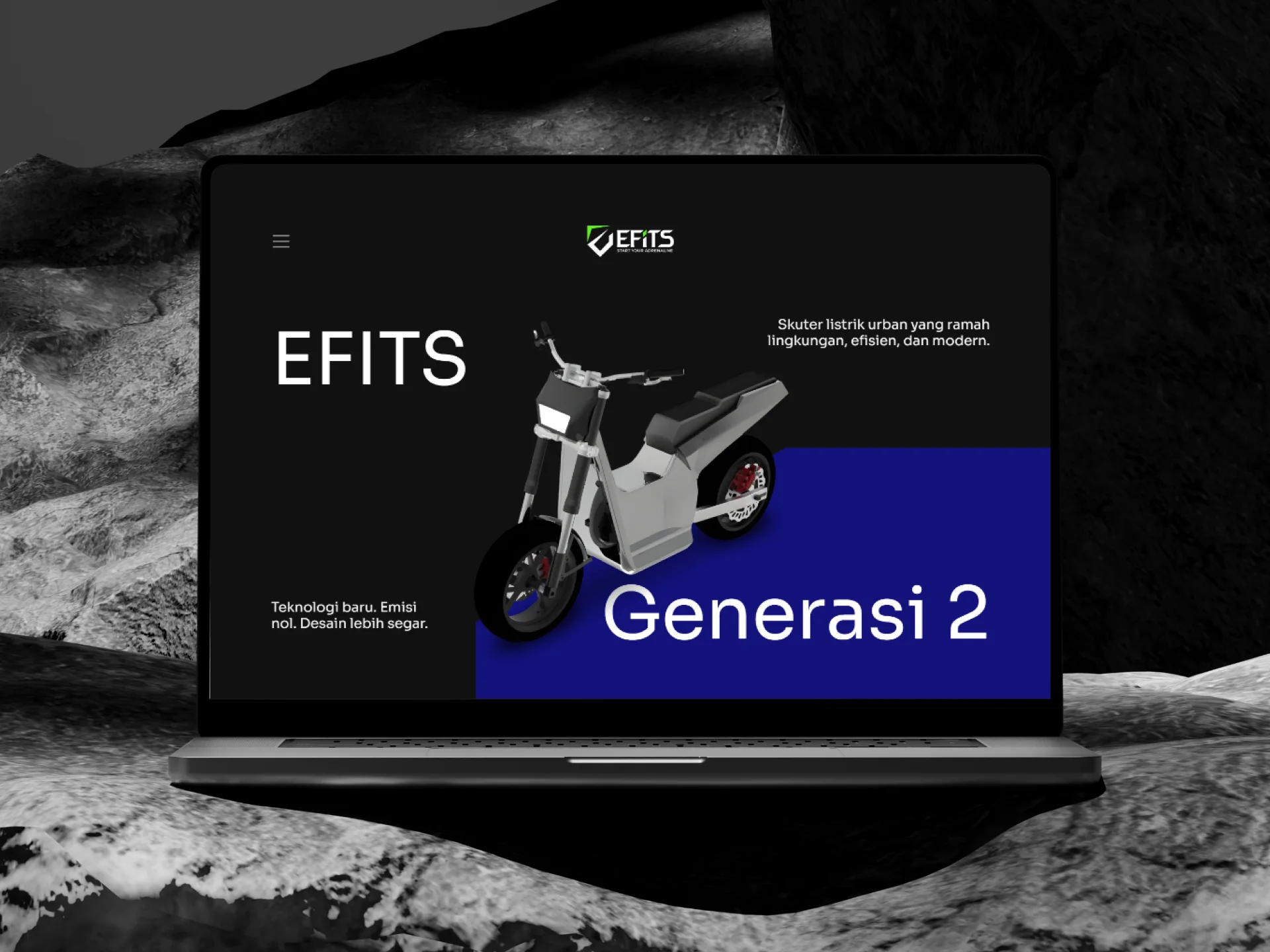
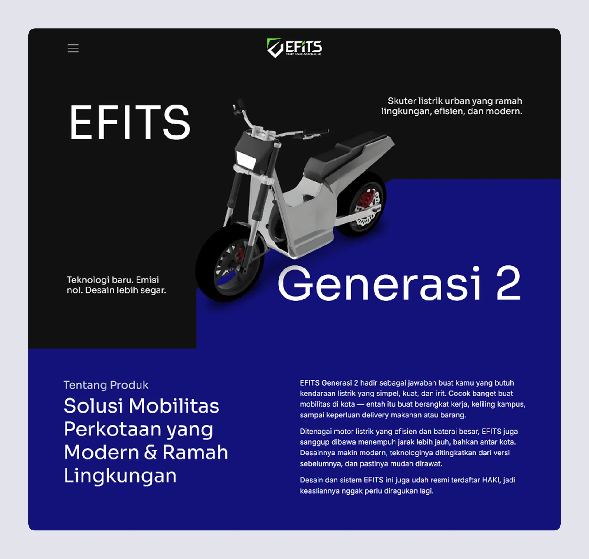
The hero section uses a hard geometric split: deep black on the left, electric blue block on the right, with the 3D scooter render physically crossing that boundary. This was an independent compositional decision, arrived at without a direct reference from the client. The split was chosen to reflect a specific characteristic of the EFITS product itself, the sharp, angular body lines of the scooter's physical design. A soft gradient or centered layout would have communicated a different product personality: smooth, approachable, consumer-grade. The hard split communicates precision, edge, and confidence, qualities more aligned with what an institutional evaluator needs to see in a fundable engineering project.
The product gallery — close-ups over overview shots
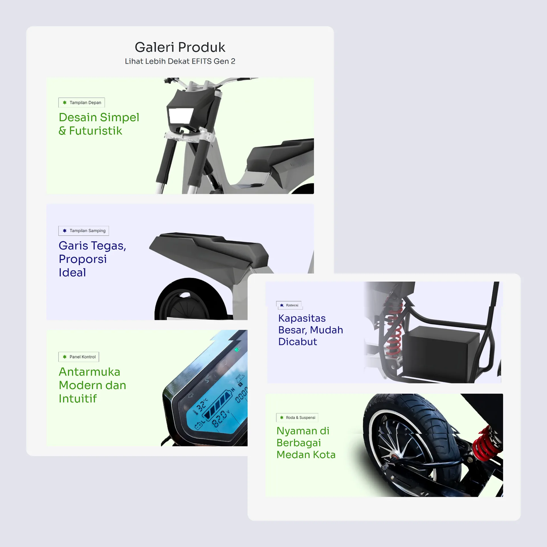
Rather than presenting the scooter in full-view lifestyle photography, the gallery section uses labeled close-up renders, front view, side panel, control interface, battery compartment, wheels and suspension, each with a short descriptive headline provided by the client. The decision to structure the gallery around component-level detail serves a specific evaluator need: it demonstrates that the design has been considered at an engineering level, not just a concept level. A funding evaluator who understands product development reads close-up technical detail as evidence of design maturity.
The hero section uses a hard geometric split: deep black on the left, electric blue block on the right, with the 3D scooter render physically crossing that boundary. This was an independent compositional decision, arrived at without a direct reference from the client. The split was chosen to reflect a specific characteristic of the EFITS product itself, the sharp, angular body lines of the scooter's physical design. A soft gradient or centered layout would have communicated a different product personality: smooth, approachable, consumer-grade. The hard split communicates precision, edge, and confidence, qualities more aligned with what an institutional evaluator needs to see in a fundable engineering project.
The product gallery — close-ups over overview shots
Rather than presenting the scooter in full-view lifestyle photography, the gallery section uses labeled close-up renders, front view, side panel, control interface, battery compartment, wheels and suspension, each with a short descriptive headline provided by the client. The decision to structure the gallery around component-level detail serves a specific evaluator need: it demonstrates that the design has been considered at an engineering level, not just a concept level. A funding evaluator who understands product development reads close-up technical detail as evidence of design maturity.
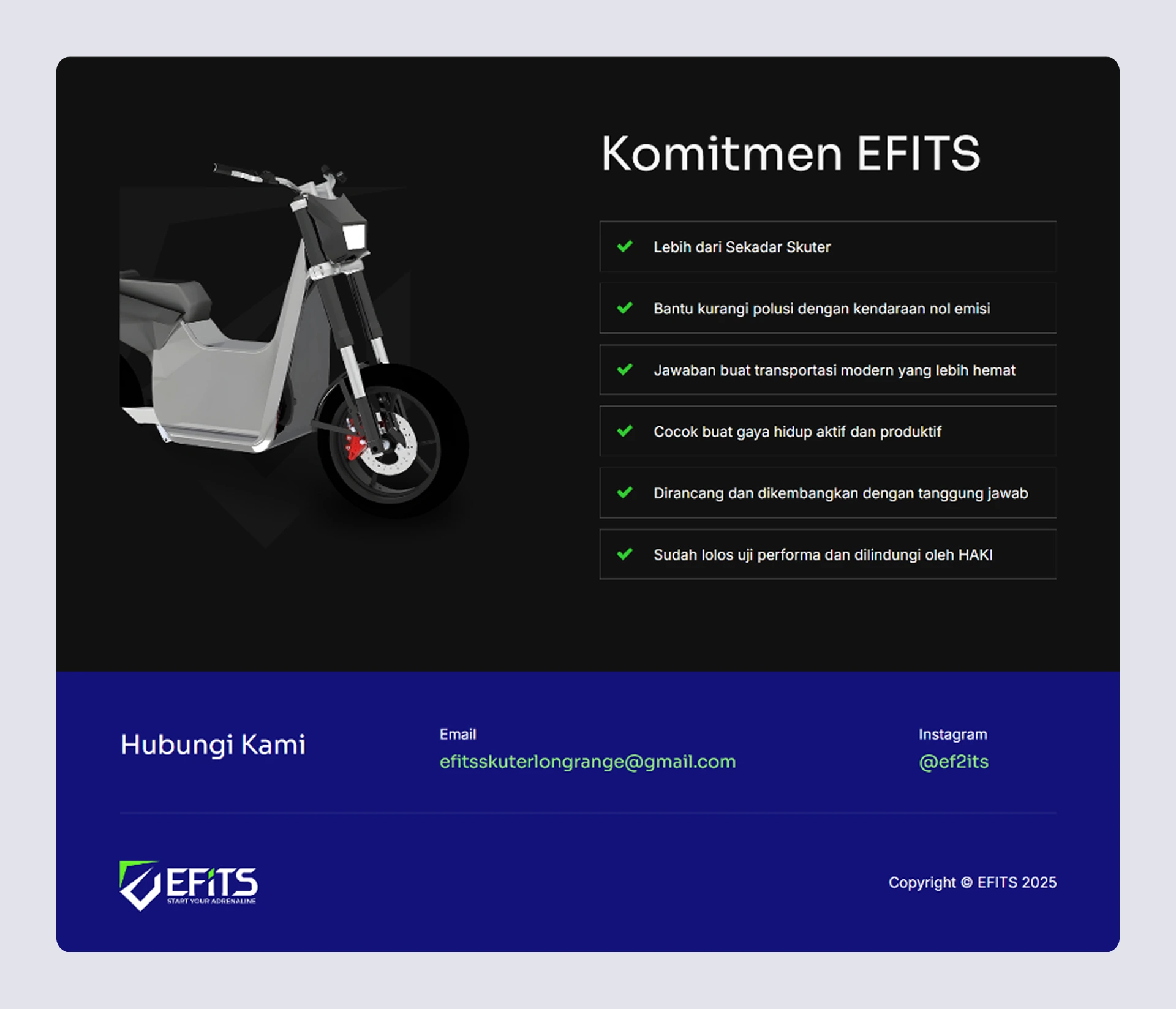
The commitment checklist — client decision, design execution
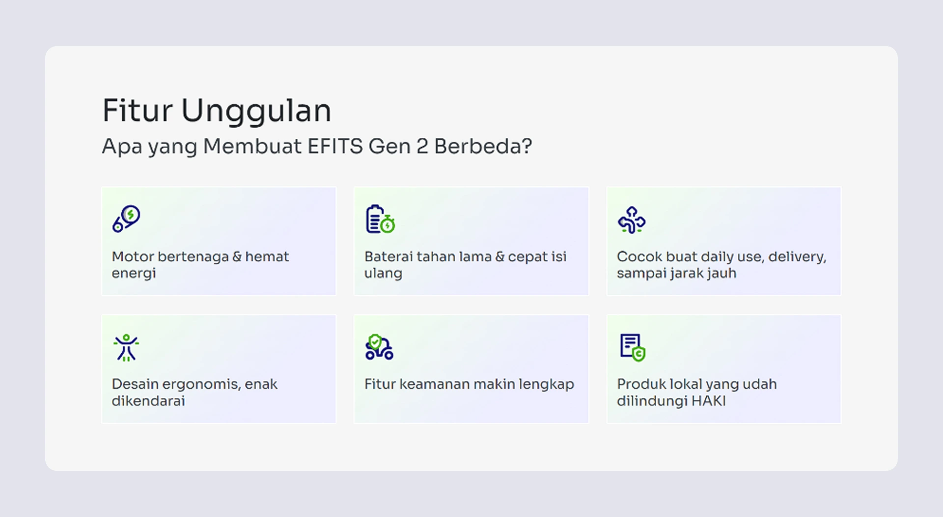
The decision to present EFITS's credentials as a checklist, including HAKI registration and performance test clearance, was made by the client. The design execution gave those items visual weight by placing them against a dark background with consistent green checkmarks at sufficient size to read as a definitive list rather than fine print. For a thesis funding evaluator, these two credentials are the most important claims on the entire page. The checklist format communicates completeness and accountability, this team has done what was required, and here is the evidence.
Color palette — brand guideline faithfully extended
The EFITS brand palette, black, electric blue, and green, was provided through the client's existing logo and brand guidelines. The design's contribution was extending that palette across an entire page in a way that felt intentional rather than mechanical: the dark hero and commitment sections bookend a lighter middle section, creating visual rhythm and preventing the page from collapsing into a single heavy tone. The green appears only as a functional accent, checkmarks, highlighted text, icon color, preserving its signal value rather than distributing it decoratively.
Wrap Up
EFITS Gen 2's website was built for one specific purpose: to make a thesis-stage product look serious enough to deserve institutional funding. The design had no commercial conversion goal, its job was to give a real but early-stage product the visual credibility that its credentials, HAKI registration, performance testing, considered engineering, deserved.
The most independent design decision was the hard split hero. It was not referenced or directed, it came from reading the product itself and translating its physical character into a layout decision. That translation, from product design language into web composition, is the kind of decision that only works when the designer has understood what the product is actually communicating, not just what it looks like.
This case study is honest about its scope: the content was client-provided, the checklist structure was a client decision, and the brand palette was inherited. What was designed was the visual system that made all of that content land with the weight it needed, and the compositional choices that made a student project feel worth funding.
This case study proves the ability to design within tight constraints, inherited brand, client-determined content, specific institutional audience, and still make decisions that are genuinely strategic rather than purely executional.