Building a brand from zero, how a new umrah travel agency earned credibility in Indonesia's visually saturated pilgrimage market
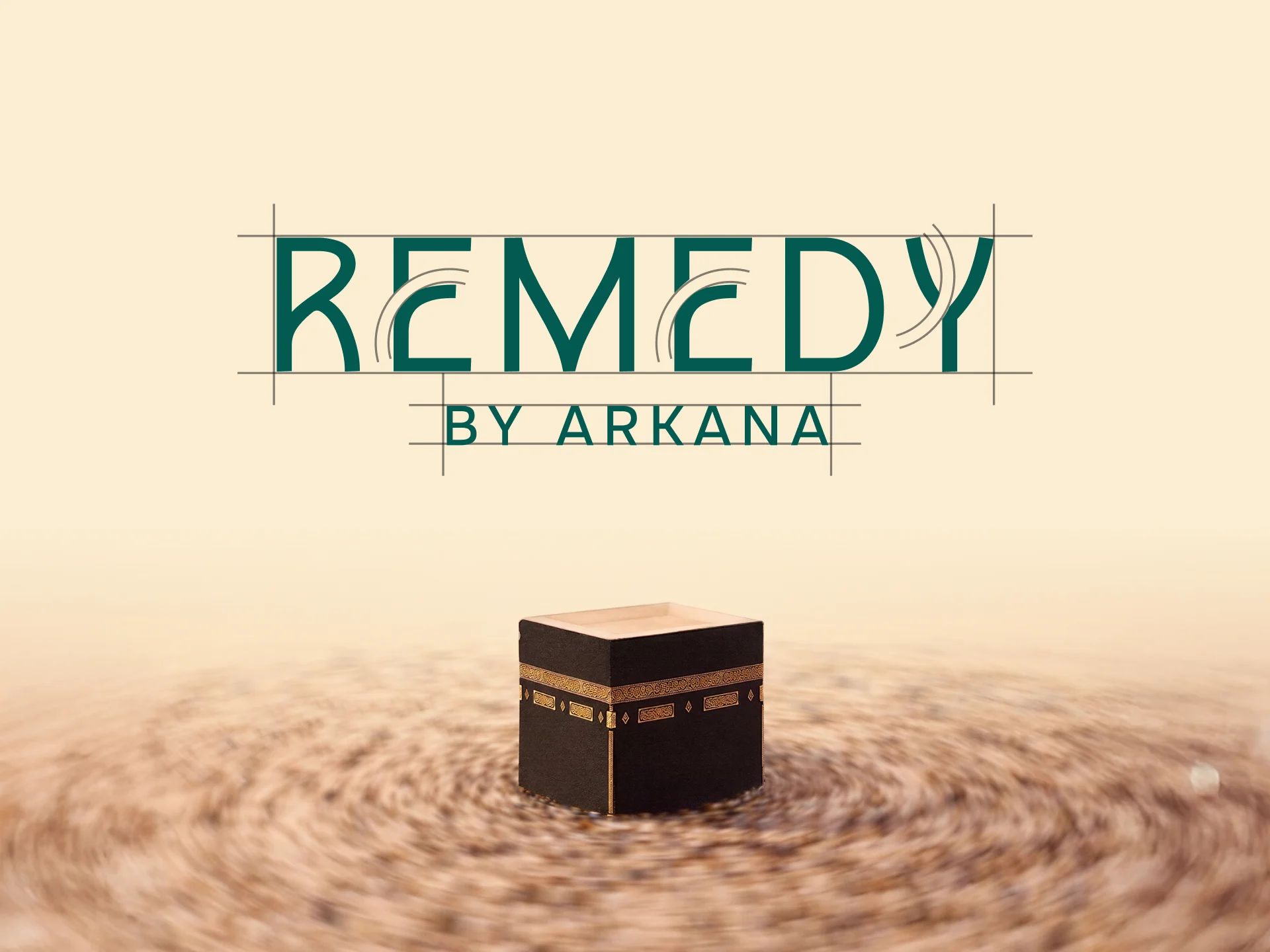
Remedy by Arkana redefines the journey to Baitullah, not as tourism, but as the ultimate remedy for the weary soul.
Role 🎮
Brand Designer
Type 🧑💻
Full Time
Industry 🌐
Travel
Timeline 📅
Jul 25' - Aug 25'
Overview
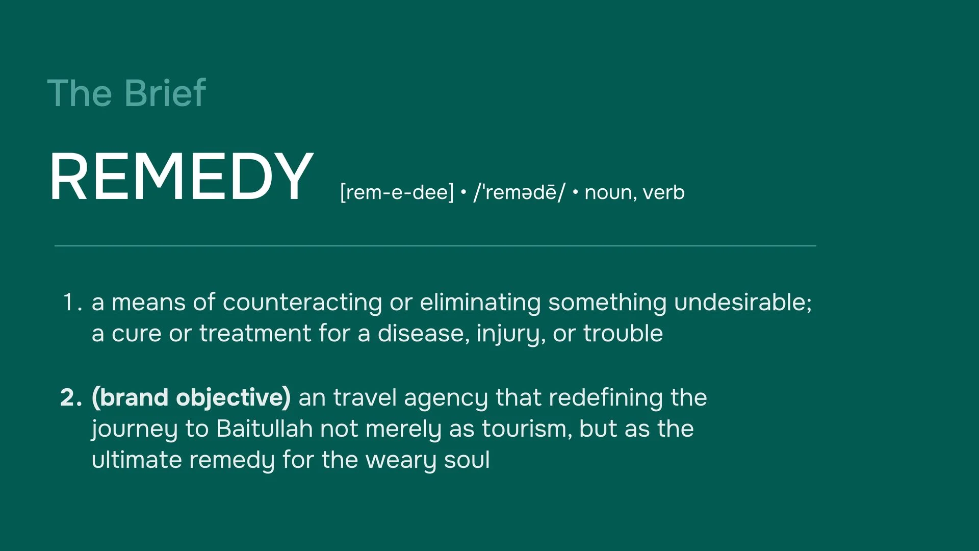
Arkana is an IT consultancy that, in 2025, introduced Remedy by Arkana as a brand-new business unit focused on umrah and halal travel. This venture started from the ground up, with few existing customer base, growing reputation in the travel industry, and minimal brand recognition to lean on. Remedy is designed specifically for Indonesian Muslim pilgrims, especially those who are embarking on their first journey or looking for a more thoughtful, guided experience. The brand operates primarily through digital platforms, like its website, social media, and online booking, so it’s crucial for its visual identity to build trust and credibility before any personal interactions take place. The leadership emphasizes their mission with the tagline: "Partner Perjalanan untuk Ibadah yang Lebih Tenang," which translates to being a travel partner for a more serene and guided act of worship.
Problem
Remedy was stepping into one of Indonesia's toughest service markets, umrah travel with few reputation, established connections, and different pricing advantages that typically come with being a newcomer. In this arena, customers are making a deeply personal and financially significant decision: fulfilling a once-in-a-lifetime religious duty. Trust is the key factor in their choice, and established agencies have built that trust over years of positive word-of-mouth. Unfortunately, Remedy had none of that to lean on.
On the digital platforms where Remedy aimed to make its mark, the prevailing visual style was pretty bland: generic mosque images, decorative Arabic designs, and corporate color schemes that all looked alike. If Remedy adopted a similar visual strategy, it would only be judged on price, a battle no newcomer can win.
The challenge went beyond just looks. It was about creating a distinct visual identity that could inspire potential customers to reach out, even when they were making one of the most important purchases of their lives, all without any prior track record to support them.
Goal
Design a complete brand identity system that gives Remedy a credible, culturally resonant, and visually distinct presence in Indonesian digital and physical channels from day one.
The identity needed to do three things simultaneously: signal trustworthiness to first-time buyers making a high-stakes religious investment; differentiate clearly from the generic visual conventions that dominate the competitor landscape; and function as a scalable system across all brand touchpoints, digital acquisition, pilgrim operations, physical materials, and social media content, without requiring constant designer intervention for every new output.
Secondary constraint: all assets needed to be deployable by a small team, meaning the system had to be clear, consistent, and self-explanatory enough for non-designers to execute within the established visual language.
ID Card + Lanyard
The operational identity problem
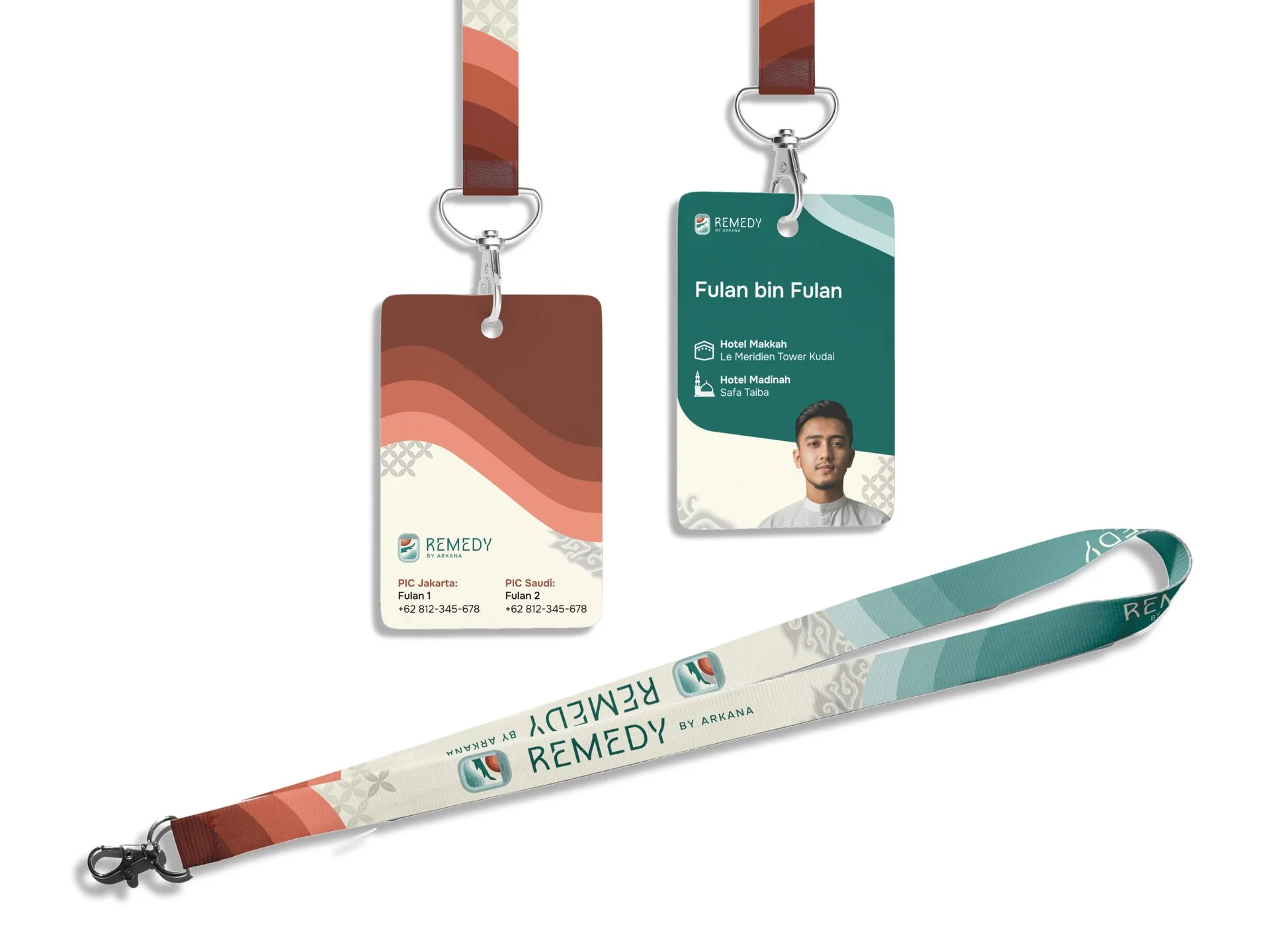
An ID card for umrah pilgrims is not a corporate badge. It is a functional safety tool used in one of the world's most densely crowded environments, the Masjidil Haram and its surroundings during peak pilgrimage season. A Mutawif (pilgrim guide) needs to identify their group members quickly, accurately, and at a distance. The design had to prioritize legibility and instant brand recognition under real operational pressure, not just look good in a mockup.
At the same time, this card is one of the most personal brand touchpoints in the entire system. A pilgrim wears it throughout their journey, it is photographed, kept as a memento, and seen by other pilgrims and their families. It needed to feel like an extension of Remedy's identity: calm, premium, and distinctly Indonesian.
The cultural layer
Two batik patterns were integrated into the lanyard and card design: kawung and megamendung. These were not decorative additions. Kawung, a Javanese royal motif built on circular geometry, echoes the tawaf, the circular movement of pilgrims around the Kaaba that is central to the umrah ritual. Megamendung, the Cirebonese cloud motif, carries associations of spiritual elevation and the sky. Together they embed Indonesian cultural identity into a document that pilgrims carry into one of the holiest sites in Islam, creating a quiet but meaningful connection between where they come from and where they are going.
The wave motif from Remedy's core visual system was retained as the dominant structural element, ensuring the ID card remains immediately recognizable as part of the same brand family as the logo, guidebook, and banner. The batik patterns reinforce cultural origin without disrupting system consistency.
Umrah Guidebook Cover
Why the cover matters beyond aesthetics
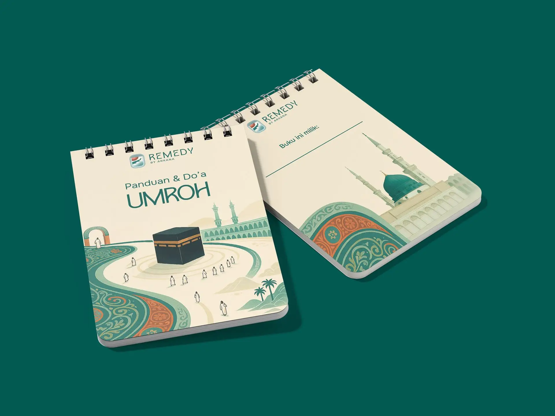
The guidebook is the one brand asset a pilgrim interacts with continuously — before departure, during the journey, and after returning home. It sits on coffee tables, gets photographed, and is shared in family WhatsApp groups. In a market where word-of-mouth is a primary trust driver, the guidebook cover functions as passive marketing collateral in the hands of every pilgrim Remedy sends.
The cover needed to do two things the logo and ID card could not: carry rich, scene-setting illustration that communicates the emotional promise of the journey, and stand out on a physical surface in a way that a wordmark alone cannot.
AI as a production decision, not a shortcut
Commissioning a custom Kaaba illustration at the level of detail required, architecturally accurate, atmospherically rich, consistent with the brand palette, would have been prohibitively expensive and time-consuming for a brand at launch stage. The decision to use AI image generation as a starting point was a deliberate production choice: it compressed the ideation-to-draft phase significantly, allowing more time and budget to be spent on what AI cannot do, brand alignment, color correction to match the exact teal and terracotta of the identity system, compositional refinement, and integration with the wave motif and typographic system.
The AI output served as a high-resolution reference that was then manually refined: color grading to match the palette, removal of architectural inaccuracies, adjustment of the pilgrim figures for scale and composition, and integration of the brand's signature wave elements into the foreground. The final cover is not an AI image, it is a brand asset that AI helped produce faster, under full creative direction.
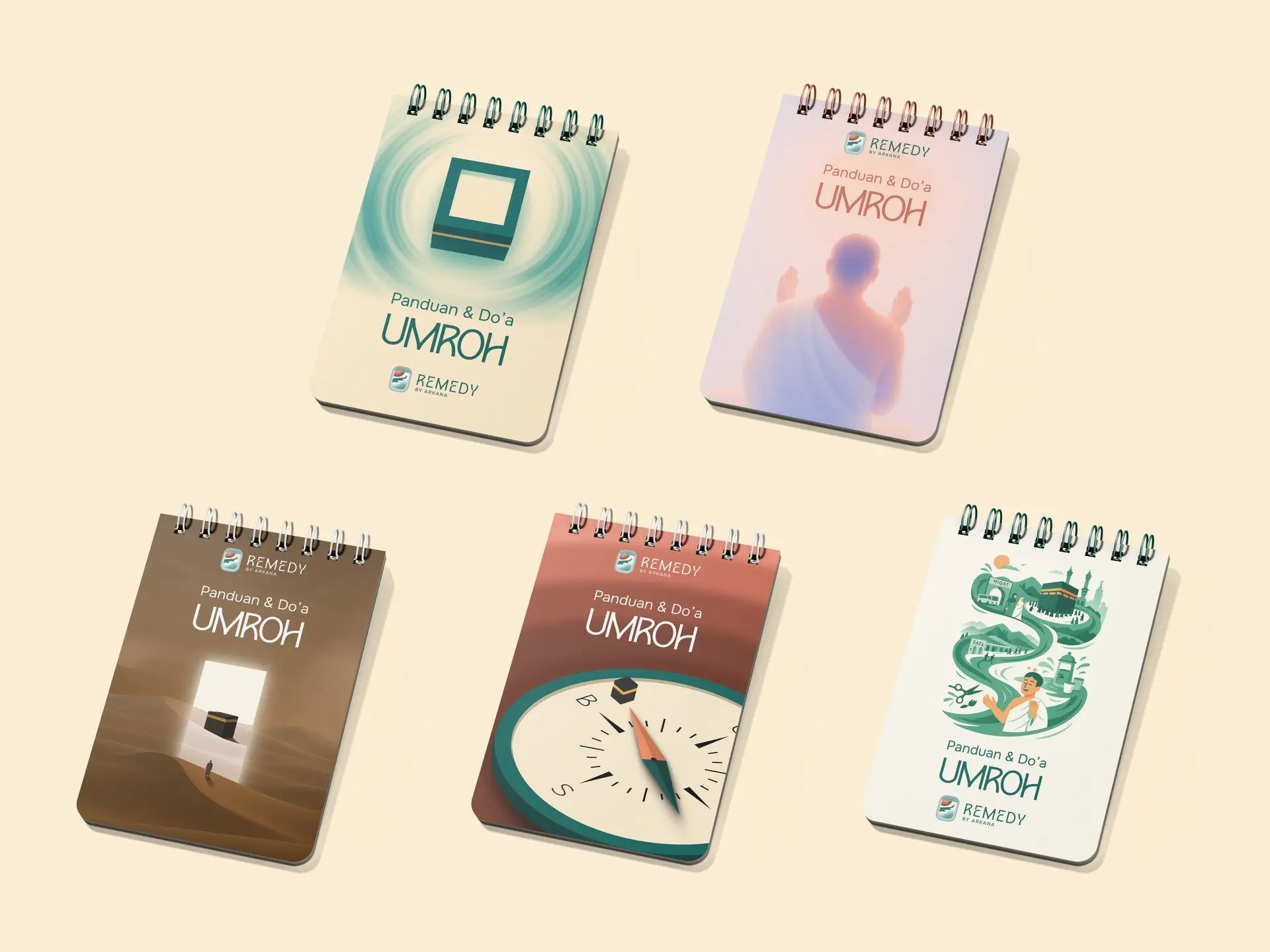
Five alternative cover concepts were developed and presented to Remedy's leadership for evaluation. Each explored a different visual approach to the same brief, from minimal and abstract to illustrative and cinematic. The selected direction was chosen because illustration at this level of warmth and detail was the only approach whose visual logic could extend consistently across future guidebook editions, seasonal content, and social media, making it a system decision, not just a cover decision.
Commissioning a custom Kaaba illustration at the level of detail required, architecturally accurate, atmospherically rich, consistent with the brand palette, would have been prohibitively expensive and time-consuming for a brand at launch stage. The decision to use AI image generation as a starting point was a deliberate production choice: it compressed the ideation-to-draft phase significantly, allowing more time and budget to be spent on what AI cannot do, brand alignment, color correction to match the exact teal and terracotta of the identity system, compositional refinement, and integration with the wave motif and typographic system.
The AI output served as a high-resolution reference that was then manually refined: color grading to match the palette, removal of architectural inaccuracies, adjustment of the pilgrim figures for scale and composition, and integration of the brand's signature wave elements into the foreground. The final cover is not an AI image, it is a brand asset that AI helped produce faster, under full creative direction.
Five alternative cover concepts were developed and presented to Remedy's leadership for evaluation. Each explored a different visual approach to the same brief, from minimal and abstract to illustrative and cinematic. The selected direction was chosen because illustration at this level of warmth and detail was the only approach whose visual logic could extend consistently across future guidebook editions, seasonal content, and social media, making it a system decision, not just a cover decision.
Banner
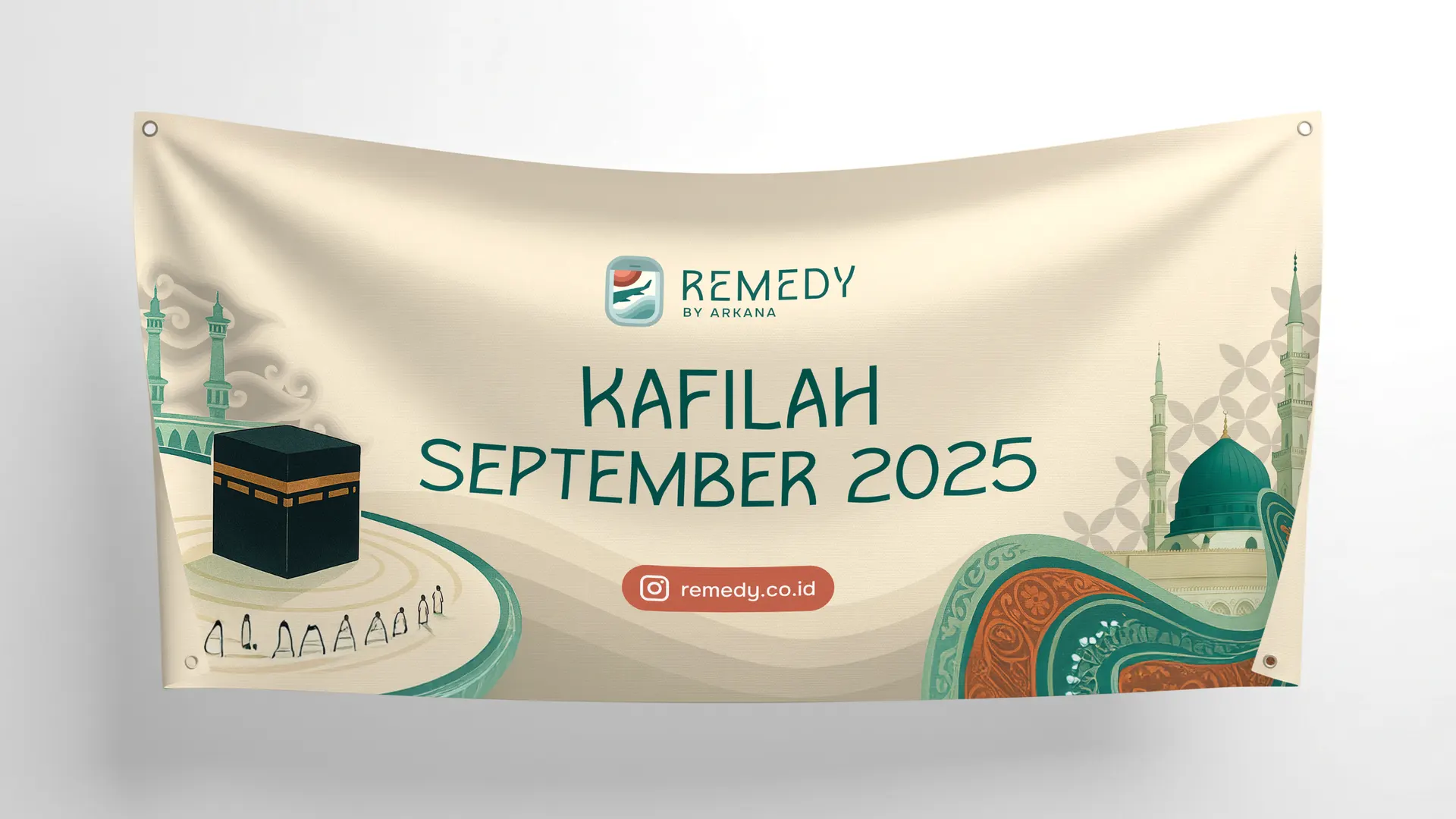
For a new umrah agency, the most credible proof of legitimacy is not a brochure or a website, it is a photograph of real pilgrims at the holy sites. The banner was designed specifically for this: photographed with Remedy's first pilgrim group in Madinah and Makkah, those images became the brand's most trusted marketing asset, circulating across family WhatsApp groups and Instagram without any paid media behind them.
The Instagram handle embedded in the design functions as the conversion mechanism, anyone who encounters that photograph and wants to know more can find Remedy immediately. The visual system scales cleanly across future groups: the event-specific text is the only variable that changes, while the brand remains fully consistent.
The Instagram handle embedded in the design functions as the conversion mechanism, anyone who encounters that photograph and wants to know more can find Remedy immediately. The visual system scales cleanly across future groups: the event-specific text is the only variable that changes, while the brand remains fully consistent.
Wrap Up
Remedy launched into a crowded market with a visual identity that positioned it as a premium alternative from day one, not a variation of what already existed. The illustration-led system proved scalable: the same visual logic now runs across the pilgrim's ID card, guidebook, banner, and website without redesign.
The most important decision was rejecting the category's visual conventions entirely and building a system rooted in Indonesian cultural identity — kawung and megamendung batik, a distinctive color palette, and a custom illustration approach validated by leadership across five explored directions. Each decision traces back to a specific business problem, not a visual preference.
The first kafilah is complete. The brand has its proof. What follows is scale.